From: caroleigh@c...
Date: Wed Mar 9, 2005 7:49 pm
Subject: Critique: Rich Baker (Angle of View - 3 photos)
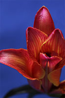
Front View - A very exotic blue background to set off this very exotic,
blood-red flower, Rich. The colors are incredibly saturated and lush,
which I really like. And the depth of field is very deep, which is almost
has to be with a flower like this, which has so much depth to it. I think
the photo would be more effective had you not cut off a sizable portion
of the right side. It makes me feel kind of uncomfortable viewing it.
Kind of like Van Gogh and his ear . . . The two major hot spots on the
flower are also a bit distracting. I know the petals are probably waxy
and shiny and it was difficult to eliminate that entirely, but I'm thinking
the photo might be more effective had you dulled those hot spots. But
then I'm thinking, too, that hey, this is a waxy, shiny flower! Why pretend
it isn't? No, I say diffuse the light even more!
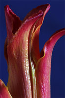
Back View - You went for a vertical format here, which I think is most
effective and most appropriate, given the vertical rise of the petals.
I'm going to ditto my comments about color and background and light. Now
squint at your picture. See where it gets very dark there in the upper
left and where it's quite light in the front and on the right? Front and
right are great -- saturated colors and a little bit of hot spots, but
not too bad; had you reflected some light onto the flower there on the
left, you might have evened out the tones and so you would have had even
MORE lush color to your photo.
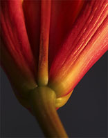
Bottom View - This is my favorite of your three. I like the angle and
the curve of the stem coming into the shot. I like how you put the base
of the flower there in the lower third of the photo and had the rest of
the flower shooting up from that, filling the remaining two thirds. And
your background sets off the exotic red color very, very well. Had you
put a little more light into the scene there on the lower and middle left,
I think the photo would have had more punch, more impact. I'm being a
little picky here, but you have the beginnings of greatness with this
shot. A little more light and you would have nailed it!
Carol Leigh