From: caroleigh@c...
Date: Sun Oct 17, 2004 9:58 am
Subject: Critique: Rich Baker (Primary Colors - 3)
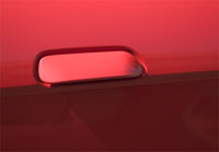
Open Open Open
Good red color -- both dark and light. I like the composition in that
you didn't center the handle and that there's a slight diagonality to
the shot for movement. Would it have worked as a straight horizontal line
and not a diagonal? Yes. This is a very spare shot . . . some might look
at it and think, "so what?" But I kind of like its simplicity
and cleanliness. When I take photos like this, I've gotten comments like,
"I wonder why you took this," which in the past I've interpreted
as a negative statement, a slam. Now, I don't care. I like really simple
things like this and I know that most other folks probably will not. So
off we go, Rich, marching to the beat of our different drummer . . .
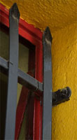
Window Corner
Hmmmm . . . Great yellow, great red, great verticality. Two things are
sort of bugging me here, and that's that the colors look very muddy and
muted, getting very dark there where the diagonal red line comes down
from the horizontal line, which I'm finding sort of busy, too. Kudos to
you for even noticing this, but then you do notice little things that
the rest of us just pass by. Interesting photos, Rich, as usual. Thanks
for posting these.
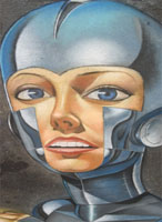
Capped in Blue
Sharp focus, good depiction of the color blue, frame-filling, dramatic
image. I've got to go to one of these chalk festivals -- they look pretty
neat. How could the picture be improved? I don't think it can . . . maybe
that grease spot there to the left of the person's face could be gotten
rid of, but otherwise, it pretty much stands alone solid as is. Nicely
done, Captain Bleu.
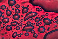
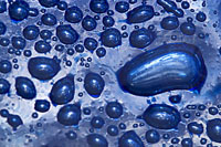
Glass Bubbles: I'm going to talk about both photos together, since the
concept's pretty much the same. And it's a very cool concept! The red
one is more appealing to me simply from a design perspective. There's
a feeling of movement in the red one; more of a static feel in the blue
one. Why? I think it's a matter of composition. In the red photo, we have
the two larger elements there on the right-hand side of the frame and
it looks as though the red bubbles are either emanating from or heading
toward the gap between those two elements. A couple of the bubbles are
sort of elongated, too, as though they were moving or flowing. In the
blue photo, although you have the one larger element, there's not the
same feeling of flow -- more like raindrops on a waxed car! Interesting
photos, both, but I'm liking the dynamism of the red over the serenity
of the blue.
Carol Leigh