From: caroleigh@c...
Date: Wed Nov 3, 2004 6:41 am
Subject: Critique: Rich Baker (Car Art: 5 photos)
Taking a quick glance first at all five thumbnails, I'm thinking that
the first two images are your strongest ones. Why? Because in those two
images I believe you had a very clear idea of what you wanted to portray,
much more so than you did in the last three images. Let's take them one
by one . . .
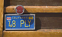
48 PLY - If your concept was CUTE LICENSE PLATE and WOODY, you've depicted
it beautifully. No question about the Woody part, no question about the
plate. The red reflector is a very nice touch, especially since it sort
of offsets the blue and yellow of the license plate. (Gasp! Primary colors!).
And those three primary colors are a nice contrast to the warm tones of
the wood. The composition, too, is good. My eyes go first to the reflector/plate
combo pack and then sweep around to the right, coming back to land on
the plate/reflector again. I also like the way the horizontal lines lead
my eye from the plate/reflector to the other side of the photo.
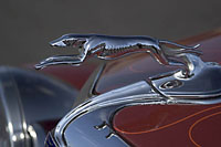
Hood Ornament - Here, too, there's a nice feeling of movement with the
greyhound leaping off the front of the car and there's room for it to
leap into. If your concept was OLD CAR and HOOD ORNAMENT, you've conveyed
it well. There's enough of the car (the headlamp and the hood) to see
that it's old, and there's no real distraction behind the hood ornament,
which would diminish it.
An aside: In this country, where we read from left to right, we're generally
more comfortable with elements that lead our eye from left to right. In
other countries, where they read from right to left, those folks are generally
more comfortable with art that leads their eye from right to left. Your
photo, therefore, Rich, would do quite well in Japan!
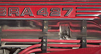
Red Engine Cover - Here I think that you were attracted by the color,
the chrome, and the repeating horizontal lines, all of which are terrific.
And I like how there's a bit of a curve in the upper right and down toward
the lower left to break up the angularity a bit. But I'm thinking that
by eliminating the first part of what I'm going to assume is the word
COBRA, you've jarred the viewer into wondering where it went. Truncating
the word makes me uncomfortable and therefore not as receptive to the
image as I might have been.
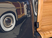
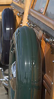
Woody Reflection/Woody Spare Tire - Here's where I think your vision got
somewhat muddled. If what you liked here was the reflection of the Woody,
you've certainly kept it to a minimum. But wait -- this is a trick! You
see, I was thinking that the tire in the upper right was a reflection,
but it's not, is it? It's the entire car there on the left that's a reflection.
I'm thinking that this is way too confusing a shot with no real focal
point of interest and not a strong design or clean composition. And I
think the same thing happened with the Woody Spare Tire. If you were emphasizing
the spare tire, then cutting off a large portion of it diminishes the
concept of spare tire. And by having an out-of-focus tire in the background,
you've again diminished the concept of spare tire by making it a distracting
element BEHIND the prime spare tire. Again, sort of a busy photograph
where I'm not sure what you were trying to emphasize.
Your first two photos, what I consider the strongest of the five you submitted,
are clean, clear, tell a story, and have a sense of design to them. The
Red Engine Cover fills the frame, but fills it TOO much, I think, to tell
a story. And the final two are just a bit too busy for my taste, for them
to be effective.
Carol Leigh
