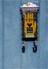
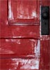
Good eye for spotting this. And I like how you placed the mailbox in the upper right third of the photo. Would a little more space at the top been in order? Perhaps . . . seems just a tad crowded there at the top. But that's a minor point. Cute graphic image, nice photograph, two more and you've got an interesting tryptich! And the blue and the orange? Complementary colors!
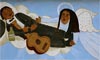
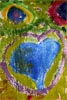
Very clever! This one made me smile. I'll bet this was tough to compose. Do you go for a horizontal or a vertical? Where do you place the main focal point? Not easy, but I think you handled it well.
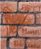
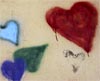
I think this is the weakest of the bunch. I photographed this mural, too, and it was very hard to crop in without cropping something off, and in this case the guy on the left has part of his head sliced off and there's something dark and roundish intruding into the photo . . . Maybe when photographing this mural we either had to shoot the whole thing or not at all . Kudos to you for finding things that no one else seemed to. Very refreshing. Very well done.
Not critiqued.
Not critiqued.
Not critiqued
Not critiqued