From: caroleigh@c...
Date: Fri Oct 29, 2004 5:30 am
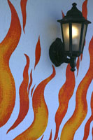
Subject: Critique: CJ Middendorf (S-Curves: 4 photos)Flames to Light -
Okay, this qualifies as S-curves! (Don't know what
Cabby Bloss is going to say, however, now that you've used HER photograph!)
What I like is the way the curvy lines all lead your eye to the upper
right of the photo and, hence, to the lamp. The only way the photo could
be improved, I think, is if you were to leave just a bit more room to
the right and above the lamp. It looks sort of squished in.
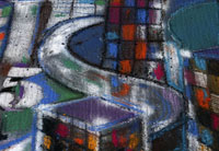
S-Curve in Chalk - Very intriguing. I like how you selected the various
elements that are accompanying the S -- the circle on the right, the box
on the left, and the 5 is very cool. Yeah, you did well here, isolating
just one portion of a larger piece of work. And as I hold my hand up and
crop the shot various ways, there are lots of other ways you could have
presented this image -- I like it as is. Well done.
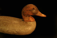
Antique Duck - Yup, major S-curve working here! Very pretty light (hmmm,
could that have been light from a light stand that someone made for you?)
and the colors are warm, rich, and mellow. There's plenty of room for
the duck to swim into the scene/to look into the scene. I find myself
wishing I could see the whole duck (the duck, the whole duck, and nothing
but the duck) and the fact that its body has been truncated sort of bothers
me. Perhaps a bit less "looking room" on the right and more
tail feathers included on the left . . .
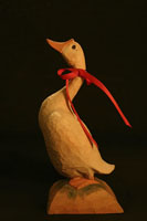
New Duck - Good vertical lines on this and you know what I like? I like
how the red ribbons echo the line of the duck's back. You've got triple
parallel diagonals going on, and so you are hereby awarded 48 points.
I sure hope you've been keeping score . . . How could the shot be improved?
Perhaps if you'd begun your photo at the bottom with the base the bird's
standing on rather than having that black line across the bottom. Without
the extra foreground, the bird would "flow" more up into the
photograph. Hold your hand up to the bottom of your photo and see what
you think.
Of these last two, I'm preferring the first one due to its really aged
look. It's worth going back and doing again. And it would look good on
a greeting card.
Carol Leigh